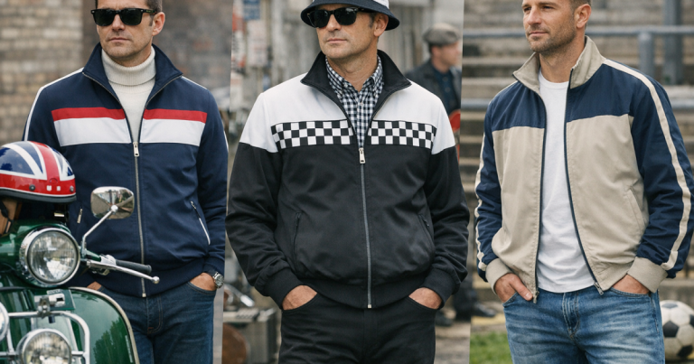
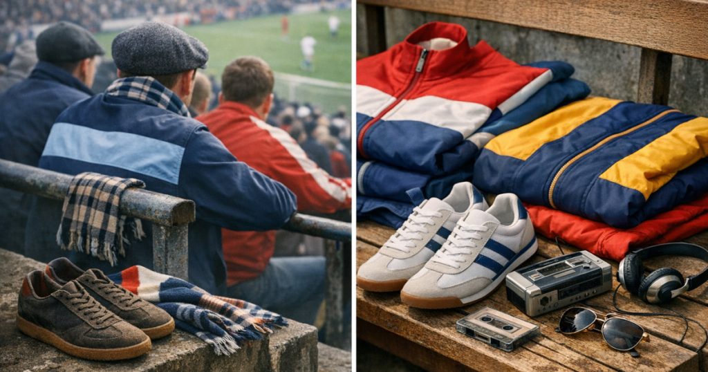
Retro sportswear campaigns are good at borrowing mood: floodlit stands, archive badges, a bit of rain, a half-zipped track top. Separating terrace heritage from that atmosphere means asking where the garment, brand or styling cue actually lived before it became a lookbook shorthand.
The aim is not to police who can wear what. It is to read the difference between genuine cultural memory, careful reissue work and styling that simply borrows the visual language of football casual culture.
What to know first
- Heritage is built through use, not just age. A logo can be old without having a meaningful terrace story.
- Marketing often compresses decades into one mood. Real terrace style is more regional, era-specific and club-sensitive.
- A convincing sportswear story usually has evidence: period wear, supporter adoption, music overlap, photographs, catalogues or credible oral history.
- Modern wearability matters. A piece can have real roots and still look wrong if the fit, colours or styling are handled carelessly.
Step 1: Ask whether the story starts with wearers or with a campaign
The first test is simple: who gave the item its meaning? In terrace culture, brands became significant because supporters wore them repeatedly in real settings: matchdays, away travel, pubs, clubs, record shops, estates, seaside towns, markets and city centres. Marketing can document that story, but it cannot create it retrospectively without evidence.
Look for signs that the brand or garment was adopted from the ground up. Was it worn by football lads in a particular period? Did it cross over with rave, Britpop, scooter scenes or regional casual looks? Did it appear in documentary photography, fanzines, old matchday footage or personal collections? A good starting point is understanding why certain tracksuit brands became terrace symbols, because the status came from repeated social use rather than brand storytelling alone.
If a campaign uses terrace language but gives no route back to actual wearers, treat it as styling until proven otherwise. Moodboards are not history.
Step 2: Check the timeline, not just the logo
A logo badge is often the easiest thing to revive, but the cut and context are harder to fake. A 1970s tennis-style track top, an 1980s casual jacket and a 2000s Kappa-style full set do not speak the same language. They carry different proportions, collars, cuffs, fabrics and footwear associations.
When a brand claims archive credibility, ask which era it is referencing. Is the silhouette close to the period being evoked, or has it simply placed an old mark on a modern shape? A slim cropped top with ribbed cuffs gives a different signal from a looser nylon set with wide track pants. Neither is automatically better, but they belong to different moments.
This is where terrace heritage becomes more than nostalgia. It depends on a believable chain between decade, fit, geography, supporter use and the way the garment was actually worn. If the campaign mixes 1980s casual cues with 2000s shapes and vague football language, it may still look good, but it is not a precise cultural reference.
Step 3: Separate brand importance from brand presence
Some brands genuinely shaped terrace sportswear. Others were merely around at the same time. Adidas, Sergio Tacchini, Fila, Ellesse, Diadora, Kappa, Lacoste and Reebok all have different routes into British casual memory, and those routes vary by decade and region.
Adidas is a useful example because its story is not just about the Trefoil. It connects to trainers, track tops, European imports, indoor court shoes, leisurewear and an enduring supporter vocabulary. That is why the question of how Adidas Originals became a terrace benchmark is about more than logo recognition. The same principle applies to other brands: the badge matters, but the lived context matters more.
Be cautious with brands that lean heavily on terms such as archive, casual, terrace or football-inspired without showing how their garments were adopted. Those words may be accurate, but they need supporting detail.
Step 4: Read colour like a local, not like a stylist
Colour is one of the quickest ways marketing drifts away from reality. A campaign might pair a red jacket with blue trainers because the palette looks sharp, but on a British matchday those colours can carry club associations. In some cities, even small colour choices can shift how an outfit reads.
That does not mean every piece of sportswear needs to be decoded like a scarf. It means the wearer should understand when colours are neutral, when they nod towards a club, and when they risk looking like a confused mash-up. Navy, forest green, burgundy, cream and black often sit more quietly than bright primary combinations, but context still matters.
For a more detailed read on this, the guide to how club colours work in terrace tracksuit culture is useful because it treats colour as social language, not just outfit coordination.
Step 5: Look for adoption beyond the official story
Strong heritage leaves traces outside brand channels. Search for old fan photos, music videos, street photography, forum memories, second-hand listings, period catalogues and interviews. None of these is perfect evidence on its own, but together they help you spot whether a piece had a real life.
Personal memory matters too, especially in UK casual culture, where regional scenes did not always leave neat records. Someone from Bolton, Liverpool, Glasgow, Manchester, Cardiff or London may remember a brand differently because local shops, travel routes and club rivalries shaped what people actually wore. Heritage is rarely one clean national story.
Marketing tends to flatten this. It prefers one clean mood: vintage football, retro tracksuit, terrace nostalgia. Real culture is messier. It includes taste, rivalry, aspiration, import hunting, affordability, one-upmanship and the pleasure of finding something others had not clocked yet.
Step 6: Test whether the outfit works in the real world
A believable terrace-inspired outfit should survive normal use. If it only makes sense in a studio, it may be more costume than style. Try asking practical questions before accepting the look as convincing:
- Would the jacket work over a polo, knit or plain T-shirt without looking forced?
- Do the trousers sit naturally with trainers, or are they styled only for a campaign pose?
- Does the colour combination make sense for your local club context and your own wardrobe?
- Is the branding doing all the work, or does the cut carry the look?
- Could you wear one part separately, or does the whole outfit depend on a full-set statement?
This does not mean modern reissues are inferior to vintage originals. Reissues can be easier to wear, easier to care for and less fragile. The key is honesty: are you wearing a modern piece inspired by a culture, or are you claiming it as a direct continuation of that culture?
Marketing phrases that need evidence
Some phrases appear so often in retro sportswear that they become almost meaningless unless the brand explains them. Treat these claims as prompts for checking, not automatic proof:
- Archive-inspired: Which archive piece, from which period, and what has changed?
- Terrace-ready: Is it referencing football casual style accurately, or just using the word terrace for mood?
- Heritage brand: Heritage in which sport, scene, country or decade?
- Classic fit: Classic to whom? A 1980s fit and a 2000s fit can be completely different.
- Football culture: Is there evidence of supporter adoption, or is the link only visual?
The best campaigns do not need to overclaim. They show the garment, explain the reference, respect the scene and let the details do the work.
Examples of the difference
A convincing reference
A track top that clearly draws from a known era, uses proportions close to the original mood, pairs with appropriate trainers and avoids exaggerated slogans usually feels grounded. It does not need to announce itself as authentic every five seconds.
A marketing-only reference
A new piece with a vaguely old badge, random football language, clashing club-coded colours and no explanation of the archive source may still look decent. But it is better understood as retro sportswear styling rather than meaningful cultural continuity.
A modern interpretation
This is often the most honest category. A brand takes the energy of terrace dressing and makes something wearable now. It may not be historically exact, but it can still be respectful if it avoids false claims and understands the codes it is borrowing.
Questions people ask
Can a new tracksuit have real terrace credibility?
Yes, but usually as a continuation or reinterpretation rather than an original artefact. The credibility depends on the brand’s history, the design reference and whether the styling understands the culture.
Is vintage always more authentic than reissue sportswear?
No. Vintage pieces can have stronger period character, but reissues can be more wearable. Authenticity comes from context and accuracy, not age alone.
How do I avoid looking like I am wearing a costume?
Keep one or two strong references and balance them with normal clothes. A track jacket with good trainers and a plain layer often reads better than a head-to-toe recreation.
Do club colours matter if I am not going to a match?
They can. In everyday settings the stakes are lower, but British football colour associations still shape how outfits are read, especially in club cities.
Are all terrace-inspired campaigns cynical?
No. Some are well researched and genuinely respectful. The difference is whether they show specific references, understand the scene and avoid turning supporter culture into a generic backdrop.
Main lessons
Separating real cultural weight from retro sportswear marketing is mainly about asking better questions. Who wore it first? Which decade is being referenced? Does the fit match the story? Are the colours socially aware? Is there evidence beyond the campaign?
The best terrace-inspired dressing does not need to shout. It respects the history, wears naturally now and leaves enough space for personal taste rather than simply copying a lookbook version of the past.