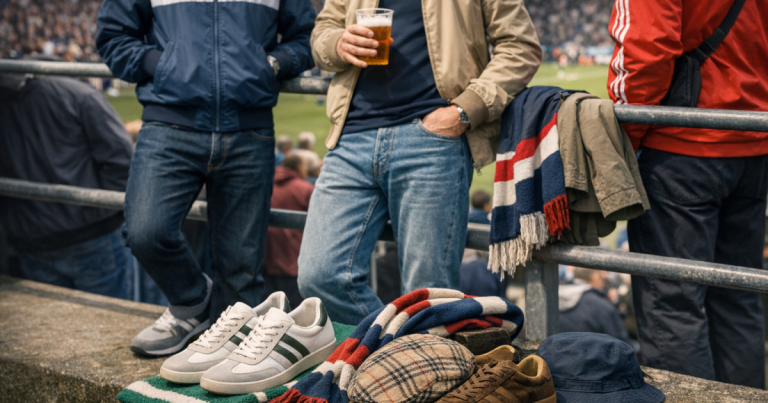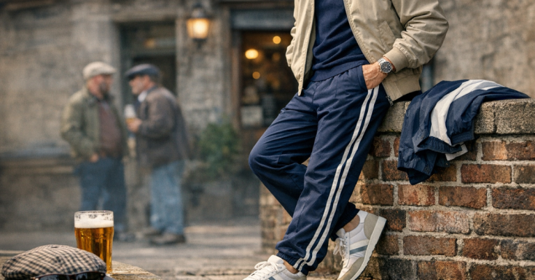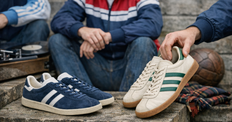
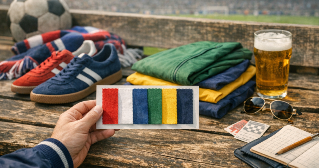
A matchday outfit can fall apart long before the fit does. Too many loud colours, the wrong trainer shade, or a jacket that fights the scarf can make decent clobber look accidental. The trick with terrace style colours is to build a tight palette first, then let the brands, cuts and era references do the talking.
Colour is never just decoration in British sportswear culture. It can hint at a club, a city, a decade, a music scene or a particular stand-side attitude. The best looks usually keep that energy subtle: a navy track top with red piping, bottle green against stone, black with a flash of gum sole, or a royal blue shell jacket toned down with faded denim.
At a glance
- Start with one base colour, one supporting colour and one accent.
- Keep club colours suggestive rather than full-kit obvious unless you are actually wearing colours to the match.
- Use trainers to either echo the jacket detail or calm the whole outfit down.
- Let vintage-style brights breathe by pairing them with navy, grey, stone, denim or black.
- Match the mood of the fabric to the palette: shiny nylon, brushed cotton and velour all carry colour differently.
Why colour matters on the terraces
Terrace dressing has always carried signals. Some are obvious, like a scarf or pin badge. Others are quieter: the particular shade of blue on a track top, the contrast piping on a zip-neck, or the flash of suede on a trainer. Colour can make a look feel northern, Italianate, rave-adjacent, mod-leaning, Britpop, 1980s casual or early 2000s Saturday afternoon without turning it into costume.
The key is restraint. A strong colour worn head to toe can work in a full tracksuit, but it needs confidence and the right setting. For most matchday outfits, especially if you are moving between pub, train, ground and post-match food, a controlled palette looks more natural. If you are still getting your head around the language of the scene, the British tracksuit culture glossary is a useful way to decode the terms without losing the cultural context.
The three-colour rule, terrace edition
A reliable matchday palette usually has three jobs: base, support and accent. The base is the colour doing most of the work. The support colour sits comfortably beside it. The accent gives the outfit a pulse without taking over.
Base colours that rarely let you down
- Navy: the safest terrace anchor. It works with white trainers, red detailing, yellow crests, green stripes, grey marl and light denim.
- Black: sharper and more urban, but it can flatten retro sportswear if every piece is black. Break it with white, silver, burgundy or gum soles.
- Stone or ecru: good for a softer casual look, especially with green, brown, navy or burgundy. It also stops bright jackets looking too shouty.
- Grey marl: useful under track tops and shell jackets because it absorbs louder colour rather than competing with it.
- Dark green: a strong but grown-up base that pairs well with cream, navy, brown leather tones and off-white trainers.
Accent colours that feel right
Terrace accents work best when they look like they belong to the garment rather than being added for attention. Think red piping on navy, yellow branding on green, sky blue panelling on white, burgundy stripes on cream, or orange zip pulls on a dark shell jacket. The accent should appear once or twice across the outfit, not everywhere.
Club colours without looking like full kit
Building around club colours is natural, but there is a difference between a nod and a replica-strip effect. If your side wears red, a red track top with white trainers and dark jeans may be enough. Add a red scarf, red cap and red trainers and the look can lose its casual edge. The same applies to blue, green, claret, amber or black-and-white palettes.
A more wearable approach is to take one colour from the club and soften it through sportswear. Forest green becomes a retro track jacket over stone chinos. Royal blue becomes a zip-up worn with navy joggers. Claret becomes a polo under a neutral shell. Amber becomes a small detail rather than the full headline.
For derby days or away trips, also think about context. Some colours carry local meanings around grounds and pubs. You do not need to be paranoid, but you do need to be aware. A terrace-literate outfit reads the room as much as the wardrobe.
Era palettes that still work now
Different decades treated colour differently, and that is why some outfits feel authentic while others look like fancy dress. You do not need to copy a full era head to toe. One colour idea is usually enough.
Late 1970s and early 1980s: clean, continental, club-ready
This palette is built around navy, white, red, bottle green, burgundy and cream. Track tops often look strongest when the colour blocking is crisp and the branding is allowed to sit quietly. A navy jacket with white stripes, off-white trainers and straight-leg denim gives the nod without shouting. Sergio Tacchini and Fila references sit naturally here, especially when the colours are rich rather than neon.
Late 1980s and 1990s: braver shells and brighter contrast
This is where turquoise, purple, yellow, teal, black, silver and red can all appear, often on nylon or shell fabrics. The danger is overdoing it. If the jacket is loud, everything else should step back. A bold shell with plain black track pants and clean white trainers is far easier to wear than a full collision of brights.
Britpop and early 2000s: navy, khaki, grey and pub-floor practicality
For a more understated matchday look, lean into navy track tops, khaki outerwear, grey hoodies, faded jeans and black or white trainers. This palette feels more pub-to-ground than vintage shop window. It also works well if you want a terrace influence without looking like you are recreating an archive photo.
Curated matchday palettes worth trying
These are not rigid outfits. Treat them as colour recipes you can adapt to your own club, climate and comfort level.
Navy, white and red
A classic for a reason. Navy gives depth, white keeps it clean, and red brings the terrace bite. Try a navy track top, white or off-white trainers and one red detail: piping, socks, scarf stripe or cap logo. An Adidas Originals Firebird Track Top can be a useful reference point for this kind of clean sportswear colour blocking, but always check the current colourway and fit rather than assuming every version lands the same.
Forest green, stone and gum
This is one of the easiest grown-up palettes. A dark green jacket over a stone or ecru layer looks relaxed without going bland. Gum-soled trainers, brown suede touches or a beige cap keep the whole thing grounded. It works especially well for autumn fixtures, train travel and colder evening kick-offs.
Black, silver and white
A strong option if you prefer your terrace style sharper. Black track pants, a black or charcoal top, white trainers and a small silver or white logo detail can feel modern without losing the retro sportswear thread. Keep the silhouettes relaxed rather than skinny, or it starts to move away from the casual reference.
Royal blue, grey and cream
Royal blue can be brilliant, but it needs calm company. Grey marl and cream take the edge off and stop the outfit becoming too primary-school bright. A blue track jacket over a grey sweatshirt with cream trainers is simple, wearable and still recognisably matchday.
Burgundy, navy and off-white
Burgundy is underrated in terrace dressing because it adds richness without shouting. Wear it as a polo, track top panel, cap or stripe rather than necessarily as the main jacket. Navy and off-white make it feel heritage rather than wine-bar smart.
How trainers control the palette
Trainers can either repeat your accent colour or quieten everything down. If the track top has red trim, a small red detail on the trainer can pull the outfit together. If the jacket is already bright, plain white, cream, black or gum-soled trainers are usually safer.
Be careful with perfect matching. A green jacket, green trainers and green cap can look more styled for a photo than worn for a Saturday. Terrace style tends to look stronger when there is a bit of friction: navy with off-white, burgundy with grey, black with gum, sky blue with denim. For more on getting the footwear balance right, see the guide to matching retro trainers with a track top.
If you want a simple trainer reference, something like a Puma Palermo shows how suede, gum tones and colour blocking can soften a sportswear outfit. That does not mean every colourway will suit your wardrobe; look at the dominant shade, sole colour and logo contrast before deciding how it fits your palette.
Using caps, scarves and layers without colour clutter
Accessories are where many matchday outfits get too busy. A cap, scarf, cross-body bag and trainer all competing in different colours can break the line of the outfit. Pick one accessory to carry the accent and keep the rest neutral.
- Caps: navy, black, stone and dark green are easiest. A New Era 9Forty Cap in a restrained colour can finish a look without making it too sports-team heavy.
- Scarves: if the scarf is in club colours, let it be the loudest piece. Keep the jacket plain or dark.
- Hoodies: grey marl, navy and off-white are the most useful under track tops and lightweight jackets.
- Bags: black, navy or olive usually work better than bright contrast unless the rest of the outfit is very plain.
Layering also changes how colour reads. A red top under a navy jacket looks like an accent; a red jacket over a navy top becomes the statement. Decide which piece is leading before you get dressed.
Fabric changes the colour
The same shade behaves differently depending on the fabric. Shiny nylon makes colour brighter and more reflective. Cotton jersey softens it. Velour deepens it. Polyester tricot often gives a clean, sporty finish. This matters when you are shopping vintage, buying reissues or trying to blend older pieces with modern ones.
A purple shell jacket and a purple cotton sweatshirt are not the same visual commitment. The shell will catch light, show creases differently and dominate more of the outfit. If you are working with bold colours, pay attention to texture as much as shade. The era-by-era guide to tracksuit fabrics helps explain why certain colours feel tied to particular decades.
What to check before buying a colour-led piece
Even in an informational guide, there is a practical buying reality: the wrong colour sits unworn. Before adding another track top, shell jacket or pair of trainers, think about how it works with what you already own.
- Does it work with your usual jeans or track pants? If it only pairs with one difficult item, it may be less useful than it looks.
- Is the logo colour helpful? Branding can act as the accent, which saves you adding another loud piece.
- Can it handle matchday weather? Pale colours look great but may be less forgiving on wet trains, concourses and pub floors.
- Is the shade club-adjacent or too literal? A subtle nod is usually easier to wear away from the ground.
- Will the colour date quickly? Archive brights can be brilliant, but muted classics tend to earn more repeat wear.
If you already own a loud piece, do not buy more loudness to go with it. Buy calm: navy, grey, black, stone, cream or denim. Most strong terrace wardrobes are built on quiet pieces that allow one standout item to work.
Common mistakes that make the palette look off
- Too many club colours at once: scarf, jacket, cap and trainers all in the same scheme can look heavy-handed.
- Ignoring the sole colour: white, cream, black and gum soles change the whole balance of an outfit.
- Mixing eras without control: a 1990s neon shell, 1980s tennis-style top and modern technical joggers can clash unless the colours are tightly edited.
- Matching every logo: repeated branding colours can feel forced. One or two echoes are enough.
- Forgetting the setting: what looks strong in a mirror may feel too loud on a packed train at 11am.
Questions people ask
Can you wear rival club colours if the outfit is not football-related?
You can, but context matters around grounds, pubs and away travel. If a colour combination is strongly associated locally, keep it subtle or choose a more neutral palette for matchday.
What is the safest colour for a first terrace track top?
Navy is the easiest starting point. It works with denim, grey layers, white trainers, red accents, green details and most outerwear without looking too plain.
Should trainers match the track jacket exactly?
Not usually. A small colour echo can look sharp, but exact matching from jacket to trainers often feels over-styled. Neutral trainers are usually more wearable.
How do you wear bright 1990s colours without looking like fancy dress?
Make the bright piece the only statement. Pair a bold shell or track top with plain trousers, quiet trainers and minimal accessories.
Are black outfits still terrace-friendly?
Yes, if the shapes and details are right. Break up all-black with white branding, gum soles, a grey layer or a textured jacket so the look does not become flat.
Main lessons
A strong matchday palette is not about collecting the loudest archive colours. It is about control. Start with a dependable base, add one supporting shade, then use a small accent to connect the jacket, trainers and accessories. Club colours, retro sportswear references and era cues all work better when they are suggested rather than shouted.
The easiest test is simple: remove one colour from the outfit. If it instantly looks better, the palette was doing too much. If it loses its character, that colour was probably the right accent. That instinct is what separates wearable terrace style from a pile of nice pieces fighting each other.