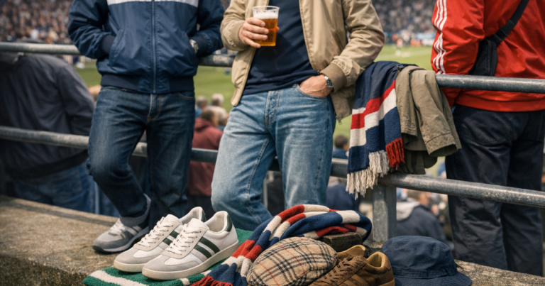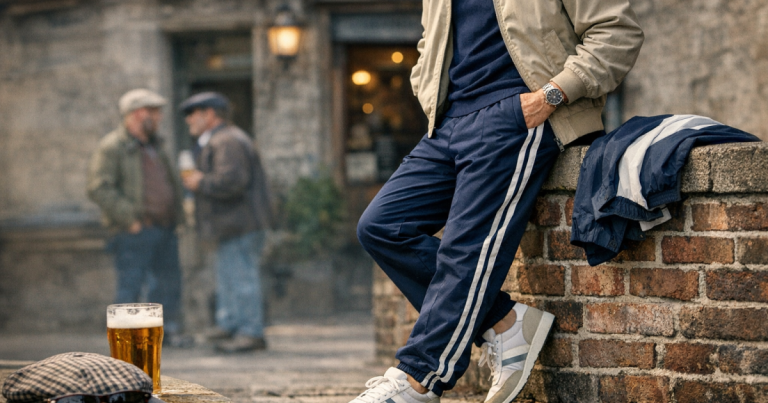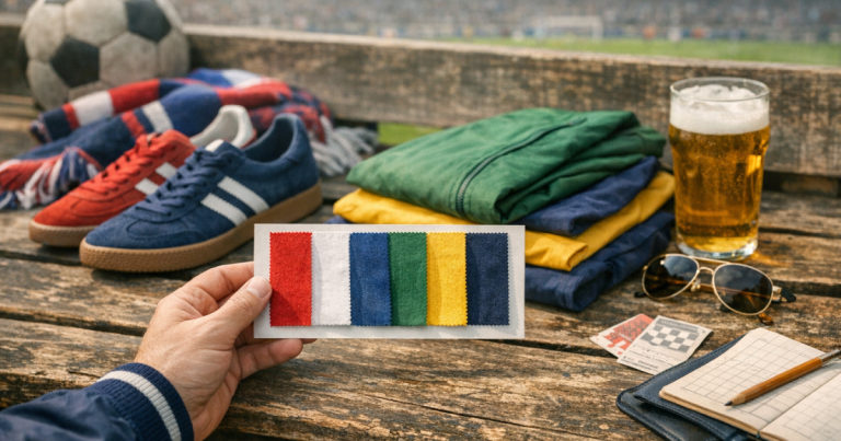
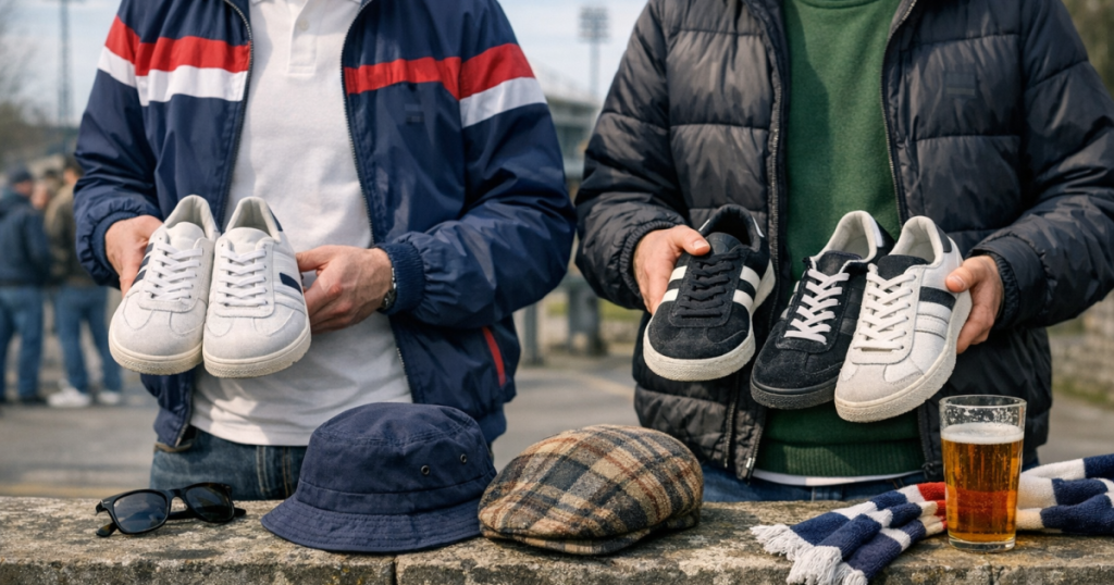
A strong terrace style outfit can fall apart when every badge, crest and trainer mark fights for attention. The trick is not to hide logos completely, but to decide which one carries the look and let the rest sit quietly around it.
That balance matters because terrace dressing has always been about recognition, restraint and timing: the right mark in the right place, not a walking advert.
In brief
- Pick one lead logo: usually the track top, jacket, polo chest badge or trainers.
- Keep supporting logos smaller, tonal or partially covered by layers.
- Avoid stacking several large chest marks, sleeve marks and cap logos at once.
- Match the logo mood to the era: sharp tennis-club restraint, bold 90s sportswear, or minimal modern casual.
- Use colour as a control: repeated brand colours feel deliberate; clashing colours feel accidental.
Why logos matter in terrace dressing
Logos in this world are not just branding. They signal era, taste, football memory, music reference and sometimes even regional attitude. A small laurel wreath, trefoil, chevron or tennis badge can say more than a loud full-print jacket if the rest of the outfit gives it space.
British terrace style developed around noticing details: a certain cut of track top, the way a zip sits at the neck, the exact shade of a trainer stripe, or the difference between a sportswear piece and a fashion imitation. For the wider background, the story of why tracksuits became terrace uniforms explains why badges and brand recognition became part of the visual language rather than a simple flex.
The problem now is that modern wardrobes often mix reissues, football shirts, caps, trainers, hoodies and outerwear from different labels. Done well, that mix feels natural. Done badly, it looks like every item was chosen separately and never introduced to the others.
Step 1: choose the logo that leads the look
Start by deciding which logo deserves attention. If the track top has a strong chest badge, sleeve stripes or a bold contrast panel, let that be the lead. If the jacket is plain but the trainers have a recognisable shape and side mark, let the footwear carry it. If the outfit is built around a polo, the chest logo can be the focal point.
A good rule is one loud logo area per outfit. Loud does not always mean huge; it can mean high contrast, central placement, bright colour or cultural weight. A small logo on a very clean polo can be louder than a large mark on a busy shell jacket because the eye has nowhere else to go.
Good lead-logo choices
- A track top with a clear chest badge and simple trousers.
- A plain knit or overshirt with recognisable trainers such as Nike Air Max 90.
- A dark jacket over a polo where the collar and chest badge show cleanly.
- A cap used as the only prominent mark, such as a New Era 9Forty Cap, with quieter layers below.
Once the leader is chosen, the rest of the outfit should support it rather than compete with it.
Step 2: count visible marks before leaving the house
The quickest practical check is to count what can actually be seen. Chest badge, sleeve logo, leg logo, trainer logo, cap mark, bag mark and football crest all count. Three visible marks can still look restrained if they are small and spread out. Two can look excessive if both are central, bright and oversized.
For a clean everyday look, aim for one dominant logo and one or two quiet supporting marks. For a bolder match-day or gig look, you can push it slightly, but the outfit still needs hierarchy. If everything shouts, nothing feels considered.
A simple visibility test
- Stand in a mirror at normal conversation distance.
- Notice where your eye lands first.
- Cover that item with your hand and see what becomes dominant next.
- If the second and third logos fight for the same attention, remove or change one piece.
This takes less than a minute and is more useful than rigid rules about never mixing brands.
Step 3: control placement, not just quantity
Logo placement is often the difference between sharp and cluttered. A chest badge and trainer side logo rarely clash because they sit in different zones. A chest badge, large scarf mark and cap front logo can clash because they all sit in the upper visual field.
Think in three zones: head and neck, torso, and footwear. Try not to overload one zone. If the cap has a strong front logo, keep the jacket and polo simple. If the torso is doing the work with a track top, let the cap be plain or absent. If the trainers are the statement, keep the trouser leg clean so the footwear gets the room it needs.
This is also where layering helps. A jacket can soften a polo logo. A half-zipped track top can reveal just enough of a T-shirt graphic without turning it into the main event. A plain overshirt can calm down a branded track top that might otherwise feel too full-on.
Step 4: match logo weight to fabric and silhouette
A logo should feel like it belongs on the garment. Heavy embroidery can work on a polo, sweatshirt or structured jacket. A shiny printed mark can suit a nylon shell or 90s-style track top. A small woven badge often suits cleaner, smarter casual pieces.
Silhouette matters too. A slim, neat outfit usually handles smaller marks better. A looser tracksuit, relaxed shell jacket or rave-leaning outfit can take a larger graphic, provided the colours are controlled. The mistake is combining a loud logo with a shape that already demands attention, then adding another loud item on top.
Step 5: use colour to make logos look intentional
Colour is the easiest way to make mixed logos behave. If the jacket badge, trainer stripe and cap mark all pick up white, navy, red or green in a controlled way, the outfit reads as deliberate. If each logo introduces a new bright colour, the eye starts jumping around.
You do not need a perfect match. In fact, an overly matched outfit can feel stiff. Aim for a family resemblance: navy with royal blue, cream with white, burgundy with deep red, forest green with olive. On the terrace-style end of the spectrum, slightly muted colours usually age better than neon clashes unless you are deliberately leaning into rave or 90s sportswear codes.
Step 6: be careful with club crests
A football crest is not the same as a sportswear logo. It brings loyalty, place and match context into the outfit. That can be powerful, but it also changes the tone immediately. A club shirt under a track top is a different message from a plain polo under the same track top.
If a crest is visible, let it take the lead or keep it secondary. Avoid putting a club crest, large sportswear chest logo, cap badge and trainer mark all in a tight visual stack. For match day, that might be fine. For a pub, record shop, weekender or everyday casual look, it can feel too loaded.
The distinction between clothing as football identity and clothing as broader casual style is worth understanding. The difference is explored more fully in football casuals vs terrace style, especially if you are trying to keep the look wearable without flattening its roots.
Step 7: keep eras in conversation
Logo balance is not only about how many marks you wear. It is also about whether the references sit together. A 70s tennis-influenced track top, 90s running trainer, modern technical cap and football shirt can work, but only if the colour and silhouette tie them together. Otherwise the outfit becomes a timeline rather than a look.
If you want a cleaner heritage feel, keep the logos smaller and the palette tighter. If you want a 90s radio, rave or Britpop-adjacent mood, you can afford more visible sportswear language, but keep one strong anchor. Modern reissues make this easier because they often preserve recognisable branding while fitting into current wardrobes.
A step-by-step way to build around logos
Use this order when putting together a terrace style outfit and you will avoid most of the common clashes.
1. Start with the strongest item
Choose the piece with the most obvious mark, colour blocking or cultural identity. That might be a track top, a polo, a shell jacket, a cap or a pair of trainers.
2. Add one quiet base layer
Use a plain T-shirt, fine knit, subdued polo or clean sweatshirt to stop the outfit becoming all badge and no shape. The base layer is where restraint earns its keep.
3. Check the lower half
If the top half is logo-heavy, keep trousers cleaner. If you are wearing branded track pants, make sure the top is not also shouting from every angle.
4. Let trainers finish rather than hijack
Terrace-style trainers can carry a look, but they should not always dominate it. If the footwear is bright or heavily branded, reduce the noise elsewhere.
5. Add accessories last
Caps, bags and scarves are easy to overdo because they sit close to the face. Add them after the outfit is built, not before, and remove one if the look starts feeling busy.
Common mistakes to avoid
- Wearing four statement pieces at once: a bold track top, graphic T-shirt, branded cap and loud trainers rarely need each other.
- Mixing too many badge positions: chest, sleeve, thigh, cap front and bag strap can crowd the outfit.
- Ignoring scale: a tiny logo and a huge logo can work together, but two large marks often compete.
- Confusing authenticity with excess: wearing every recognised label at once does not make the look more credible.
- Forgetting garment condition: faded, cracked or peeling logos can look great on true vintage, but tired modern prints can make the outfit look neglected.
Use visual research without copying outright
Old photographs are useful because they show how people actually wore sportswear rather than how brands styled it for campaigns. Look at spacing, posture, layers and what is not visible. Often the strongest outfits are calmer than memory suggests.
If you enjoy reading images for small details, how to read a casual look for terrace style cues gives a useful method for spotting proportion, brand placement and context without turning the whole thing into costume.
Common questions
Can you mix adidas, Nike, Fila or Sergio Tacchini in one outfit?
Yes, but give one brand the lead and keep the others quieter. Mixing works best when the colours, era references and logo sizes feel controlled.
How many visible logos is too many?
There is no fixed number, but one dominant mark plus one or two small supporting marks is usually the safest range for a sharp everyday look.
Should a football crest count as a logo?
Yes, visually it should. Culturally it carries even more weight, so treat it as a lead element unless it is mostly hidden under a layer.
Can a cap logo work with a branded track top?
It can, but keep one of them subdued. A bold cap with a bold chest logo pulls attention towards the same area and can make the outfit feel crowded.
What is the easiest way to improve logo balance in a terrace style outfit?
Remove one visible mark from the upper half. Swapping a branded cap or graphic T-shirt for a plainer piece usually sharpens the whole look.
What to remember
Balancing logos is about confidence, not minimalism for its own sake. Terrace dressing has always valued recognisable details, but the strongest looks know when to stop. Choose the logo that tells the story, keep the supporting pieces disciplined, and let colour, placement and era do the quiet work.
When the badges feel deliberate rather than accidental, the outfit reads as culture rather than costume. That is the difference between wearing labels and wearing the look well.